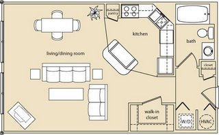
Look closely...
Yeah, no bed. I noticed it too.
Before you get all intelligent on me, yes I realize that this is what they call a "studio." I'm familiar with them and have lived in one before. But when my gay real estate agent sent this to me (another post) I thought it was weird that they would take the time to draw the furniture in there, and yet not insert a bed.
Does a person in a studio really need a dining room table? Why couldn't they put a bed there? Or even make the couch look like a futon or something. I can't stare at this and picture myself living there for the simple reason because it doesn't have a bed. Most floorplans don't have furniture layouts at all, why have one here?
I need a bed, damnit!

6 comments:
Look closer, the couch has a pull out sofa bed underneath. That, and for the unexpected guest the dining room table folds out to be a bed too! lol.
Oh IKEA is so clever!
I know, what will they think of next?
I here Murphy Beds are making a big comeback.....
If I am going to sleep on a bed with a name I would prefer either something a little more manly or a little more womanly.. definitely less geeky... MURPHY hahah
Imagine me bringing a guy home, "Excuse me while I open my wall for my bed."
Yeah Angel, definitely not very sexy!
Post a Comment